I am MAIK – your AI concierge!
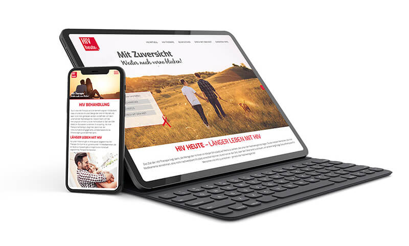
Perfect appearance on every device – mobile web design, –
that behaves “responsively”.
Thanks to smartphones and tablets, practically anyone can now be online at any time and place. An option that is being used by more and more people and has led to a rapid increase in mobile Internet use.
Coordinated appearance and user guidance for smartphones and tablets
To ensure that your prospects and customers stay on the ball on your website on their smartphone or tablet, a design that automatically adapts to the respective screen size is essential. Specifically, the responsive design adapts optimally to the available screen resolution, repositions the menu and content and scales text, images and multimedia content to an ideal device-specific size.
Responsive design as an individual device response
The website “responds” to the visual and technical requirements of the respective device and delivers the right design answer – hence the name “Responsive Design”. Of course, it is important that the entire website - from the desktop to the mobile device - is consistent and follows a consistent concept despite different presentations. It is therefore recommended to develop desktop and mobile design together.
"Web solutions
user first"

